
Laravel Backpack
October 10, 2019
4 Handy Tools For Web Design
October 23, 2019
Being a web designer / web developer, you are faced with the task of translating designs a graphic designer's has created for a project you are working on into code. Since this is not a task of just eyeballing what you see and making visual approximations, you sometimes have to dive deep into some tools that you do not normally work with to complete the task.
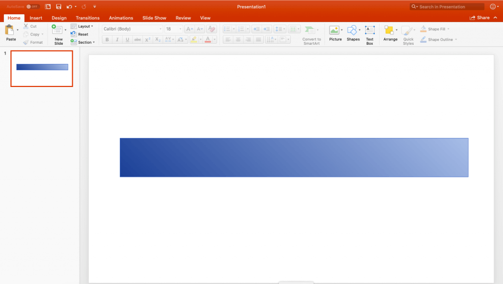
Say you are tasked with taking the following design and making a webpage with the exact same colours and it is presented to you as a power point design.
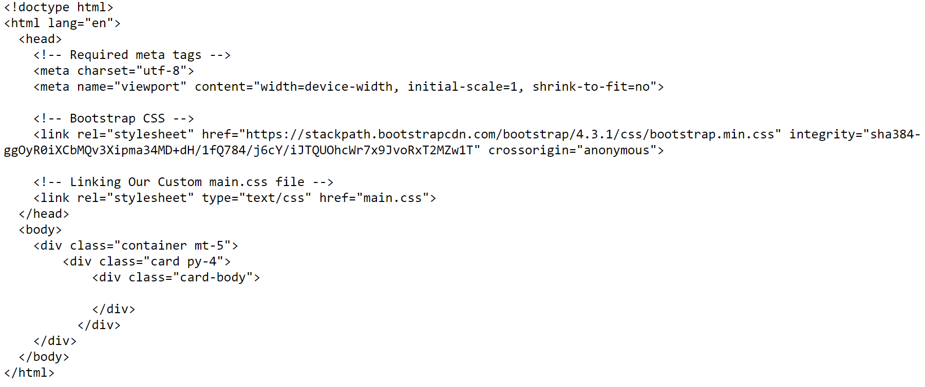
Assuming basic html knowledge, the following is a basic html template with bootstrap included as well as a custom css file where we will edit the colours
If you open the index.html file in a browser immediately after adding the above template it will contain a basic white block , but that certainly wont make the designer happy.

What we want is the block to to look just as it did in the design as far as the gradient is concerned, and we cannot simply take an eye measurement. Fortunately we know about https://cssgradient.io/. Visiting the website we see the following.
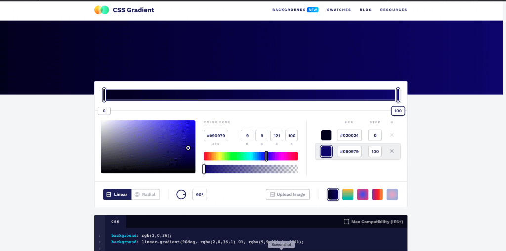
Css gradient is a visual tool that allows to us to convert RGB values into css code that we can use in our css file. All that is need now is to find the exact RGB values sent over by the designer in the power point file. Here is how . .
Follow these steps in order:
1. Select the shape you want to extract colours from.

2. Above the toolbar to the right find and click on "Shape Format"

3. In the toolbar section on the far end click on "Format Pane"

4. Under the the tab "Shape options " expand the section "Fill" and select the "Gradient fill" radio button if not already selected
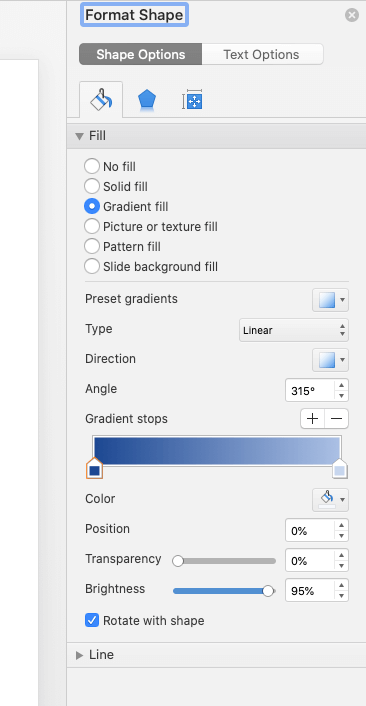
5. Still under "Gradient options" , locate "Gradient stops", click on the first gradient stop and the click the colour bucket next to the "Colour" heading
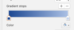
6. Click on more colours
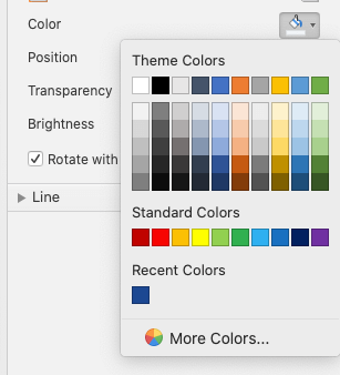
You will end up with the following window
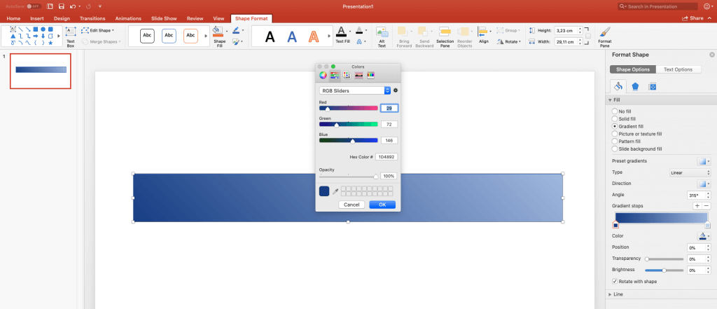
In https://cssgradient.io/ copy the the RGB values over from power point as well as the opacity value and map it to the corresponding gradient stop.
Do the same for the second gradient stop, steps (5 - 6 ) above and you should end up with something like this in https://cssgradient.io/
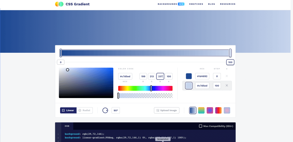
the exact same gradient as in the design. However what we are really interested in is the css part at the bottom.

Copy it into your clipboard and paste into your main.css file under the ".card" class which is the same class that references the white block we currently have in our html file.Here is the result . .
.card {
  border-radius: 0;
  background: rgb(29,72,146);
  background: linear-gradient(90deg, rgba(29,72,146,1) 0%, rgba(199,213,237,1) 100%);
}
Notice I have added a border-radius: 0 to remove the rounded edges.
Now opening the index.html file in the browser again we should see the following . .

Here is the original design once again

We have successfully recreated the design sent to us with the exact colours using html and css 😎


