What’s New In Vue
May 16, 2022
Why Communication Skills Is An Important Skill For Developers
May 30, 2022
Table of contents
- Introduction
- Examples where UI/UX went wrong
- Walmart loses $1.85 billion
- Marks & Spencer lost £55 million
- 10 sailors died due to a poorly designed checkbox
- Complicated software system causes patient to die
- Website redesign cost Icons8 47% user loss
- Crate&Barrel lost $300 million from a simple UX mistake
- Conclusion
Introduction

Image from Medium.com
You might think that large, well-known companies get things right. We all know that's not always the case. UI and UX design is crucial in almost any facet of life, but especially in the marketing or selling of products and services. In fact, bad user experience is much more common than you think. Failing to have good UI/UX has cost some companies millions of dollars.
Examples where UI/UX went wrong
Walmart loses $1.85 billion

We all know who the multinational retail corporate company Walmart is. They have approximatly 11 000 stores worldwide and are a long standing company dating back to 1962. You would think that they know what they are doing. Well, apparently not.
Walmart onced asked their customers for their opinion on whether or not their stores should be less cluttered or not. Naturally, their customers all said yes to this and Walmart proceeded to remove and declutter their stores. Shockingly, as a result of this change, Walmart lost $1.85 billion and the staff responsible for this decision got fired. They then had to undo the new change and revert back to the cluttered look.
In the end it was found out that Walmart asked the wrong question to their customers. What they should have asked was what could change or what could they improve in their stores or what could be done to improve the navgivation through aisles.
So, next time you do a survery, be careful how and what you ask.
Marks & Spencer lost £55 million

The British multinational retailer, Mark & Spencer spent £150 million on a brand new website that pretty much flopped from the get go. Although the website was visually stunning, users started to complain about their online accounts. This resulted in a 8.1% loss of sales.
Issues ranged from having to create a new account, to being unable to reset their passwords, to the website constantly crashing, to a lack of information about the products and lastly the tablet view was difficult to browse through.
10 sailors died due to a poorly designed checkbox

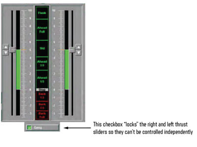
Ten sailors lost control of their ship and collided with a tanker. In the image below, you can see that there are two sliders that control the thrust of the engines. You can streer a ship in two different ways by changing the propeller thrust of one of the engines or steer the ship using the rudder. The more common approach is to just use the rubber. Most of the time the thrust if left out and the checked.

Image from Medium.com.
The investigator of the accident suggested that the checkbox was unchecked. This caused confusion amongst the sailers and ultimatly ending their lives. This all took place in under 4 minutes. The estimated cost to fix the ship was $223 million.
Complicated software system causes patient to die

A young girl who had been disagnosed with cancer had a replase and was admitted to hospital. She was on strong chemotherapy treatment and was required to be on an IV drip for three days.
She had three nurses looking after her administering the necessary mediacations and treaments. The software program that the nurses were using failed to highlight important information and was difficult to follow. This resulted in the patient dying from dehydration and toxicity.
How crazy is it that difficult to read software can cause a loss of life?
Website redesign cost Icons8 47% user loss
Icons8 is a platform were users are able to request free icons and the most requested icon gets created. The platform redesigned their website to a more clean and minimalist approach. Users quickly got frustrated and an estimated 47% of users stopped using the platform.
This shows that sometimes modernising something is not always a good thing.
Crate&Barrel lost $300 million from a simple UX mistake

A major eCommerce furniture store, Crate&Barrel, made a simple mistake that cost then millions of dollars. $300 million to be exact. When users proceeded to their checkout page on their website, they were asked to either sign in or register for an account. Most users failed to recall if they had signed up or not and were frustrated by having to create an account on checkout.
The comapny then decided to add in a guest checkout, so that users who didn't want an account could just purchase the products they wanted. Within the first month sales skyrocketed to $15 million with a 45% increase in online useres.
This just shows the power user experience has on almost any industry.
Conclusion
Many companies take user experience and user interface for granted. However, it is becoming an ever more increasily important part of businesses and more and more people are using it. These real-life stories are testament to how crucial user experience is.


